Saturday, September 7, 2013

Celebrating Life

A friendship event...

                                         inspired by the living we share with others.


This summer a few of us from Georgia, Alabama and Kentucky met in Atlanta to spend a few days with Brenda, one of our artist friends.  Over the years there have have taken classes together in Alabama, Mississippi, Georgia and Florida. 
Thru these classes, we have developed so many wonderful lasting friendships. 


Brenda has been fighting cancer this year and not able to be with us to paint in the classes, so three of us Sandra, June and myself got together and went to her home.

There with her husband, Travis, who has a humorous tolerance of our habits, we
took turns preparing the evening meals talking about old times and painting. 

Brenda's beautiful home and her gracious Southern hospitality made us all feel instantly at home.


Our first activity was to shop at Hobby Lobby for supplies.   We chatted like birds as we looked for anything we had never used... a treasure hunt of sorts.  We soon discovered the black canvases. They had just enough for us to get one for a special project for our "celebration of life" week. 

It seemed fitting that we try something new.... 


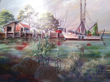
We had painted on a "tinted ground"  or toned canvas about 15 years ago at Wakulla Springs, Florida.  We used acrylic paint to tone the white canvas to a peachy pink to enhance our warm evening view of the gazebo in front of the Lodge. 


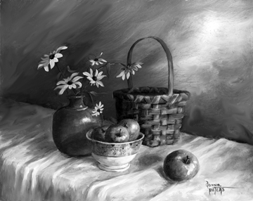
Fresh peaches in Brenda's kitchen were beautiful in a white porcelain berry bowl.

 When painting in Florida, we usually visit the pottery studio of George Griffin in Sopchoppy.  George's pottery is highly sought by collectors who appreciate good pottery. George does not do art shows making it a real treat to visit his studio for treasures.

 Brenda's pottery collection brought back many memories for all of us, including the time we painted George's chickens!  It began to rain that afternoon so we had to move to a pavillon at Otter Lake to finish. 


Painting at Otter Lake


This painting project was now a trip down memory lane as we recounted several of our more eventful experiences... and there have been quite a few!

It would be a great treat to add a piece of George's pottery to our still life.


We added a few figs picked that morning as we strolled Brenda's garden, eating fruit along the way.
We now had a very meaningful arrangement of items that celebrated our many years of painting together. 

Artists always paint better when working on subjects with personal meaning.  


The black canvas was a fun event.  The dark tone does not show through much at all but adds a "unity of  colour."  After I finished my 8 x 10 canvas,  a black frame from Hobby Lobby was a perfect addition to the art.


For those who do not paint, 
you can see from this simple accounting how special and meaningful a small painting can be. 


Our time together was a wonderful celebration of each of our lives together and the times we have shared over the years. 

A special thanks to Brenda and her husband, Travis for inviting us to visit in their wonderful home. Brenda looks wonderful.  Her energy is amazing and she inspires us all !

Make every day count... these are the good days!

Donna Peters


For information on my next workshops, drop me an e-mail so I can add you to my list to notify.  
Classes are limited in size.  Beginners are just as welcome as the seasoned artists. 


Donna Peters, artist
Deep South Studio
P.O. Box 10
Crane Hill, AL 35053

256-747-4141


Sunday, August 11, 2013

Anatomy of A Shadow

How to Paint Shadows


As promised, I want to help you learn to see or understand shadows.  Once your learn to paint what you see and not what you think you "know," shadows are fun.  They are so simple but painting them effectively can make your paintings sing.

Artists struggle to control what side of the brain is running the brush!  If you let your left brain take over, the paintings will be hard to enjoy for the artist and the viewer.  If you are a beginner, you will one day realize how to tell the difference.  Like learning how to ride a bike, no one can describe to you how it feels, but once you get there, you know it!


The shadows we will look at today are the ones marked by the three arrows in the photo of the under-painting above.  When doing your under-painting, use the same techniques of thinning your paint (or do the under-painting in acrylic thinned like water colours. If you lay on a think layer of paint, you will have to fight the textures in the final layer and it will take a long time to dry... not to mention the waste of paint.

Artists have traditionally loved painting table cloths and drapes that have gentle folds and wrinkles because they offer elements of style, texture and colour variety to the composition.


Note how shadows crawl over the folds int he tablecloth here.   At this point you can still see my pencil lines.  Not all areas are as I really want them, but I am moving in the process of making the decisions of what I want the final painting to look like.

Painting is an adventure of discovery.  

If things did not amuse or surprise the artist... 

painting would be dull, so enjoy the process.


Set an object near a lamp and turn out the other lights in the room.  Do you see how the item makes a slight warm glow almost under the very near the object?

Notice the way the shadow is dark near the object or wrinkle in the cloth but it gently fades out as it drifts away from the object and the light source.

Warm v. Cool

 
Make a "family of colours." Mix several piles of real light blue violets, light blues, light blue greys.

Next, make a family of very light warm whites using Titanium white.
Add a tinge orange to one pile of white.  Add yellow ochre to another white mixture.

Avoid Cadmium Yellow Light or Lemon Yellow as they make a "cool" white that seems to lose life or excitement.

You might want to tint another mixture of white with a bit of Alizarin Crimson for a wide variety.
Using these mixtures you can "sculpt" your table cloth to make it come alive.

Using the same recipes as mixed for the tablecloth, but a bit more intense (darker) in colour, add the shadows from your objects. My family of colours may be very different from yours, but that does not make either one of us wrong... just different.

I enjoy using a synthetic brush that is a "flat" style and about 1" wide. One of the top 2 in the photo are good for this, but one with white hog bristles could also do well. 


Close one eye and forget what the objects are and study only the colours in the shadows...
                                            letting the eye over-rule the mind.
The shadows are alive with colour.  They are not flat shapes but are like the surface of a pond with a light oil covering.  Pick and choose from all the colours of the rainbow, bouncing the colours around in the magical shadows to delight and entertain the eye.


Think about the textures of your cloth.  Allow the brush to do all the detail work .  If you use a bristle brush, you will get more texture than if you use a sable or fine synthetic brush.  Don't over-brush.

If one stroke works great it is not always great to work it as if you are scrubbing the canvas.  It will look labored and worst of all, you will mix all the  different shade until you have one solid boring colour. 

 Learn to read your own behavior.  

It is fun to get lost in a painting for hours, but the mind will grow weary and
 pretty soon you will be brushing without thinking.
Time to quit!! 

If you come to an area of a painting that is a real challenge for you, take it one like eating a whole pig... one delicious pork chop at a meal.
Limit what you plan to do.  Plan in your head what you will do in your next paint session.  How will it look?  How will it feel to hold the brush and apply the paint to the area?  If you can answer these questions, you will most likely have success. 


There are numerous ways for us to check our artfor mistakes or over-all effect.  
Try a few on my list:

1.  Turn the art up side down. 

2. Look at it in a mirror to get a reverse image so it is not the same painting you have seen too much.

3. Make a photo and open it on your desk top.  If you have a good photo program, try changing the contrast to see if you like it better.  Try other colour balance techniques.

4. Take an image and change it to black and white.


5. Best of all,  get away from it for a few days.  Get your mind on another issue... like sketching outside.  Later, put the painting in your living area but off to the side where your eye will catch it in different light and you will see it while doing other tasks.  This can be so very revealing.


I hope you have enjoyed my summertime painting. I have made an apple cobbler from the green apples.  The yellow daisies have wilted, but the summer of 2013 is captured.  Even if I sell this original, thru the painting I have celebrated life and the many blessings in my life. 

Count Your Blessings,
donna peters


A special message to the wonderful people that are painting with me this summer in my workshop:
You have heard all this in the class, but I know how our mind s can only process so much information at one time.  I hope my Blog will give you a bonus lesson and keep you inspired long after we have finished our classes.   

Thank you so much for asking me to share my art ability with you.   

donna


Thursday, August 1, 2013

How To Do An Under-painting in Oil

The Magic of an Under-painting.


 The Arrangement Snapshot


There are many benefits of doing an "under-painting"  in oil or acrylic works.  Some artists do their under-painting in acrylics and then do the final painting in oils. 

An Under-painting offers these advantages:

1.    A quick and relaxed way to cover the entire canvas with colour allowing the artist a wonderful opportunity to balance the colours, density and colour harmony.  Artists call this "killing the white."

2.    Thinking time.... time to see how the mental image will work and to think thru a variety of possibilities without loading the canvas with layers of trial and error experiments.

3.    A real confidence booster.  The under-painting is done with just a few basic colours.  Most of the time the under-painting has a brilliance or spontaneity that is fresh and unencumbered with the look of too much labor.  Yes, our over-worked and fretful brush strokes tell on us!!

4.    The best benefit of the under-painting is that the quick and easy strokes painted in this step actually become part of the final work. 


There are times when you will not want to do an under-painting, but if there is any doubt 
about what you want the final painting to look like, 
an under-painting is wonderful! 

Canvas: "Masonite" or hardboard
Size: 11 x 14"
Brush used in the under-painting:  sable flat about 1/2" wide


 Here is the under-painting for my new still life.  You can see thru the thin coats of paint and still see the pencil sketch except in the area of the background which is not an under-painting, but considered finished.
Note: The dark dots above the pottery jug are the centers of my yellow daisies to come.


 The little green apples are painted in sap mixed with Liquin Original to make it dry quickly and to thin it down.  I added a touch of red to the sap for the shadow side of each apple.


In the next step,  I cleaned my soft sable 1/2" flat brush in turp and brushed over the areas of the apples where the light was hitting them.  The "lifted" paint made the apples look 3 dimensional.  For fun, I mixed a very thin Cadmium Yellow Light with Liquin Original and lightly touched the areas of each apple where the light was the brightest. 

Without fretting or getting "detail fussy," the painting is taking shape ...quickly. 
                                                   I am enjoying the whole process.


The under-painting is a wonderful learning process for the artist to learn from the subject what works best, what should not be over-worked and best of all, how little real effort can go into a totally enjoyable painting experience.

Live to learn... Learn to live

In the next edition of this blog I hope to do a series of photos so you can understand shadows better. 
I will call it   "The Anatomy of a Shadow" 


Thank you to everyone who is following my blog.   Let me know if you have a special request or questions. 
I hope your art experience can grow and bring you hours of pleasure.  To make this process grow even faster... share what you have learned with someone.  The blessings are endless!

donna peters

Friday, July 26, 2013

The Summer Stretch

New things to try...

A new painting sits on the table easel.  What you see is an "under-painting."
Using a very thin coat of tube color,  I  simply block in the areas and items.   Artists call this "killing the white."    It is a great trick to do to get to know your composition and think about your colours and tonal relationships.  A clean white canvas can be intimidating. 

.


 Trying new things is automatic as the young artist seeks to find what they enjoy the most and  can paint the best.

As we age we tend to cycle in our favorite colours, styles and tastes.  I read a book years ago that said that women in particular change their preferences about every 7-10 years.  That must be what frightens men so much!

Last year I had trouble handling my own large framed originals at the shows.  I like the idea of painting large as it is so gratifying to complete a huge masterpiece, but it can be tiring if the painting part lasts longer than the inspiration!
This year I vowed to paint smaller works. 
They will be easier to handle and my collectors are asking for them. 


I decided to work on panels and canvases that are around 8 x10."   In the photo above you can see a few different styles of canvases.  Bottom right are 2 small linen canvases I bought in Paris.  I keep waiting for just the right subject for these... probably scenes I saw there.  That would be sentimental, fun and appropriate.  I love shopping for art supplies in other countries.  I like the banana paper from Honduras for sketches,  Sennelier oils from France and watercolour paper from Italy.

The brown panels in the canvas photo are unfinished pieces or "hardboard" or Masonite.   It is convenient to buy the 4 x 8' sheet at the hardware stores and have them cut it up in pieces.
It is more work to sand each piece and then give it about 4 coats of gesso, but the surface is smooth and great for paintings where I will have lots of fine detail and want to avoid the texture of real canvas.


In my classes if I get the time,  I teach how this is done and then even make a panel for each student so they can have the experience of painting on a new surface.  In my August still life classes I will be teaching on this substrate.


As I started inside the other day I noticed a snail on the roof of my porch!  How or why was he so diligently making his way across this surface?  

The fact that he had made it so far out of his usual location on the ground made me laugh.  I suppose he is trying new things too.

What a lesson for life.


 The search began to find all my small items that could be used in a simple still life.  It did not take long to find a full collection. 


 Next was a real treat... brush shopping!   I made a new brush holder and dug out a palette knife that is almost 100 years old.  Perfect excuse to put it to use!

I dug out one of the small table top easels I use for my classes.  I really advocate standing to paint.  It works better simply because  I move around more and get a better look at my own progress from a better distance.  


 I don't like working with artificial flowers, but for the sake of finding a pleasing arrangement, it will work real well.  If you do use artificial flowers, make sure you get the best quality.

A real key to enjoying your painting experience is to paint things you love.  The still life offers you an opportunity to immortalize  your favorite things.  As I worked with the more "traditional" items in a still life, I quickly  discovered I really wanted to paint things around me this summer.  From another genre than pearls and crystal,  I am very excited about painting little green apples, pottery and baskets. 

 I realized how my tastes have changed.  Maybe I was just going back to my country roots.  It was a personal awareness.  I enjoy my country life and the simple things around me.  Where I once thought a more sophisticated life style was what I wanted, I am most content at this time to celebrate what I have. 


If you make a change in your painting subjects or approach, take the offer of help from other artists and read their books, web sites and study their art.  If you don't find what you want to do, you may find what you do not want to do which sometimes more helpful !

Learning to paint is like getting to know the real you.
 I hope you like the person you find!

Celebrate life!   Be yourself and count your blessings.

Donna


Join my blog so you will get my next post via e-mail.   
 Thank you and I hope my sharing will inspire you !


Tuesday, July 9, 2013

Celebrate Your Own Successes !!!

What a great day!


I hope you have enjoyed my sharing all the emotions that it takes to grow, learn and paint.  When I named this blog I knew it was important to share many things that most artists might hesitate to put into words. 
The thrill of being an artist is that this excitement never goes away.  Every new painting is an unknown... an opportunity to succeed or fail.

So how am I celebrating the completion of a painting that has been "in the works" for almost 6 months?  You make apple butter!  Our home smells wonderful with all the spices and apples simmering on the stove. 


I am pleased with some new things I have accomplished in this work.  I wanted to give the viewer a wonderful hidden place under a grand old oak along the Pascagoula River where they could watch the shrimp boats come and go, the Pelicans play along the shores and moments of personal time nourish the spirit.

I invite you to share my blog with others who enjoy art or want to learn to paint.  It is my goal to share things I have learned over my lifetime of being an artist.  

If you would like to take a class in oils with me, I have just scheduled one that will be held on 2 Saturdays in August of 2013 in my little home community called Crane Hill.  

Check my web site for more details.  I will be teaching a wonderful still life composition that offers us so many different techniques... especially detail work that makes things pop off the canvas  filled with life, light and texture.

I better go.  It is time to put the apple butter in the jars and finish washing my brushes.  I thought that if I washed my brushes it would force me to take a three day break from the studio so they can dry.  

Celebrate Life
Make something happen!

 Donna Peters


All images and text on this blog are the property of Donna Peters
©2013 Donna Peters All Rights Reserved

Friday, July 5, 2013

Where do I go from here !!!

The real challenge of this painting is now on the easel.


I have been digging thru my old art magazines and some favorite books by artists of accomplishment.  I have learned that not everyone that writes an art book is "accomplished"  just bold enough to write a book!  I look at it like picking fruit at the store... be selective what you bring home to make part of your diet.


Since the painting is more than dry, I began by spraying it with "Retouch" varnish to make it look wet.  This "lifts" the colour and the values become rich so my fresh paint will not look so different against the dry paint. 

The first issue:


Not everything in a painting is the "star."   Ya'll know I like comparing a composition with music.  Elvis had a great back-up group to make him sound his best and the same is true for a painting.


If the back-up music gets to loud, it will steal the show from my boats. 

Therefore, the tree and grasses I plan to put into the foreground will need to be balanced so it only serves to explain my painting and set the environment for where I want my viewer to be when he "discovers" the wonderful view  I am presenting.

Colour is key.


The colours in this area cannot be too warm or have great contrast.  I studied my sketches and notes like a road map to a place I have never been.  I began to imagine the effect in my mind.  If I can see it in my mind, it has a good chance of coming off the brush right.

I felt confident that I knew how to make the tall grass have detail without being demanding of the viewer's attention.  I mixed a family of greens that were more toward a "veridian" green... or blue-greens. 


Using a "liner"  or "rigger" brush, I made sure I was relaxed and confident to quickly drop in a few stalks in my darkest green of the new family. 
If this grass were in the direct sunshine, it would have more yellow, red and possibly orange.  For sure it would have more detail if near the subject.

Brush strokes that are made with confidence are done quickly and NEVER appear labored!  
Practice on a piece of paper if you like. 

To the right of the tall cane grass, I want a few clumps of water grass.  It is usually a dull colour and that works well for this area.  For the most part, it will just add texture.  I used a very cheap cheap utility brush from the hardware store.  I made a blue purple for the base area of the grass and then made a white with tiny touch of yellow ochre  to put in a few  blades in that will actually be hit by the light from the sun which is to the left.  

The light touches made with the really cheap brush are quick and I pull myself away before I over do it!  This is so easy to do.  

I am really feeling great to be in the studio today.  
Outside is looks like rain and the music is just right in my comfortable space.  

After the 2 grasses dry, I should have decided what will be my next step.  I have drawn in a couple of large rocks.  I think I will keep them, but I must resist making them so detailed that they up-stage my wonderful shrimp boat.

Time for lunch!


Saturday, June 15, 2013

It's all about the little things!

When it comes to painting, it is all about the little things.


Men will always question the rigging on a boat or details of a car or motorcycle.  Women who garden know the number of petals on a Magnolia and bird lovers can tell you the age of a bird by it detail colouring.....
  so,  details are important.

Most beginner painters want loads of detail.  Older painters with years of experience want a more painterly style and bolder use of colour.  We all want an enjoyable experience with more impressive results.

Growing in your art is like all of life.  If you continue to add new experiences and challenges, life continues to be filled with joy and that leads to better health.  Take the challenge to a better life and get out there and paint!!  In my classes I work to give you courage and to inspire you to greater ideas.  Anyone who gets the courage to come paint in a small group of strangers deserves this and a fun day of trying new things.

Back to the easel....

I take many little breaks to think thru all my little details on the "big slab,"  "shrimper" or "trawler."
My shrimp boat is grand and I have painted the sunshine on its hull and cabin with Titanium white adding a little yellow ochre to give it warmth. 

The shadows under the cabin are shades of blue and grey-purple to give the shadows life.


As my students know, I rarely use a tube "black" choosing instead to make an "optic black" from
 Sap Green, 
Ultramarine Blue and 
Alizarin Crimson. 

 If you want a "cool" black, add more blue. 
 
If you want a warm black, just add more red. 

If you do not have these colours on your palette, simply use any strong blue, strong red and strong green.... never light shades or hues of anything.  For the grey colors of weathered wood...just add a little ochre or white to some of you "optic black" to get a great and alive family of greys.

Why optic black ?


Optic black is an alive black.   If you use it to paint the dark openings in your fish shacks or barns, it will not look like a flat black wall, but instead will appear as if it is a space that you can walk into.  It has depth.

I challenge you to put your tube of black paint in the drawer and learn to live with more colour in your art.

Painting water !!

Few things are more fun to paint than water.

Choose and mix the different colours in your water.  Apply using a 1" wide flat brush in short VERTICAL strokes.  Once all the canvas and water area is covered in your water colours,  take a soft blending brush and using only HORIZONTAL strokes lightly blend the colours....


Make sure you don't over work this or it will not be visually effective.


If you ever get to attend one of my classes or workshops, painting water is often part of my lesson.  The same basic technique is very effective in doing skies or backgrounds, with a slightly different twist in the brush work.  

Since the water area has a nice "buttery" layer of very juicy paint, I will want to let this dry before I begin my next step.  Remember, we are working from the back (far distance) to the front so my marsh grasses, rocks and tree on the back will come in next.

See ya next week with another report!   

Be sure to "join" my  blog so you will receive notices for the next posting.  

Google will want you to create a password account to protect my blog. 

 Thank you!!

Donna Peters


Sunday, June 9, 2013

Getting to the subject....

The next area to work on in my painting is the "subject" plane.   This is one area where we can obsess  to a paint where the painting is not fun to paint... but MOST of all such an area can ruin a painting because it can become "labored looking."    If you ever do this in one of your own works, you will always be haunted by the "over-worked" or labored emotions that come off the end of the brush and are always present to remind you of your own experience.

Learning to paint is a first step, but learning to be "painterly" in style is just as desirable.  Beginners almost always work for the control over a brush, but as we learn and grow, we desire to relax and become more painterly... less labored in style and effect.  When we begin to relax and paint for the sake of art, we are truly blessed with a new experience.


The area half way between the viewer and the horizon my subject plane.  This means it will have the most detail, contrast and colour.  I delight in painting this area, but it can also be very intimidating at first.  If the mind does not have enough information before the brush goes into action, disaster is certain.
To avoid this mistake, I set the canvas on the easel and begin to think about what I will do next.  I refer to my notes, sketches and photos for information.  I make key decisions about what should be left out and what should be simplified or altered.  After all, I am the artist and this needs to be a work of artistic interpretation... not a copy of a photograph.  


 Control your attack on the painting.  Decided carefully what should be worked on next.  Plan a program of addressing one item at a time.

I was anxious to paint the pelicans.  The sky was dry and I had gone back in with a soft pencil and drawn the birds back in using my original sketches.

Birds look so different in different seasons, at different ages and of course there are many varieties.  Be sure you use the variety that is natural to your painting location.  If you are not familiar with birds and how to paint them,  visit the works of other artists on the web, at the museums or a trip to the library.  The confidence and information you gain will be worth the trip.

I mixed lots of Liquin (my preferred medium) with Brown Madder for the beaks and bellies, yellow Ocre for the heads, and a mixture of greys for the wings and backs.  The paint was so thin that it was transparent making for great textures.  I will consider this an "under-paintng" and let it dry before going back to add more detail.  Don't forget the eyes of the brown pelican can be Cerulean blue!


 The Fish houses and docks need to look weathered.  New boats and docks never make for good paintings except for loft apartments for NYC.  'Nuf said.

My contrast is to be strong here.  Unlike the back bank, the darks are nice and dark and the light details are crisp and warm.  Let the 2 hair brush go wild, but be sure it is fun and relaxed or it will look as painful as it was to paint.
The main shrimper will be my next focus.  I worked on it a bit and the paint is like butter so I will let it dry a bit before doing more.  I want my details to be clean and crisp.  I will carefully study my photos to get all the rigging right.
If you paint trawlers in the New England area, be aware the rigging 
will be different as it is for all areas.  

I hope your mind can paint along with my sharing.  It is important to imagine doing each step yourself before you ever pick up the brush.  If you can see it in your mind's eye and feel the emotion  and excitment of capturing a special effect, you are half way there!!

A painting is above all a product
of the artist's imagination;
it must never be a copy.

...Edgar Degas 


Thank you for visiting my blog.  
I hope you will join in order to receive a notice when I post my next session for this painting.


Tuesday, May 14, 2013

At last... back at the easel !

Finally!
I am back with my Back Bay Painting today and it has taken lots of courage and time to go back to my sketches, notes and some photos to become reacquainted with my subject.  Getting the emotions back are the real key as I re-join all the smells, colors and feelings that led me to this idea in the first place.  Once a painting gets "cold" it takes time and creative courage to go back, but the rewards are so good. 

I danced and "nested" as I arranged all the materials for the painting.  The canvas went on the easel and the sketches on the table.  I squeezed a fresh palette and put all the little notes and photos in my thinking chair.  I then went out to do another job and when I came back it all began to feel more familiar.  This is how it is done....

Take it in small steps just like I teach in the classes.  That means the sky is the first thing to be painted.  I wanted it not too bright since I will want my fish houses and boats to steal the show with lots of crisp warm white and sharp detail. 


The colours are better than they show in my photo, but they are muted and a wonderful family of warm blue-greys.  Grey is the artist' best colour as it will make the crisp clean colours looks like they are plugged in.
If you have ever taken my painting class, you know the wonderful technique I have for painting skies.  It is simple without being over-worked.  Fresh relaxed brush work for the best effect is key.  as I always say, "colours that are over-brushed or mixed are great for the bedroom wall but deadly to a painting."  We women feel that the harder we work at anything the better it is..... wrong!

You can see the distant marsh vegetation I began to put in.  Careful here.  The colors have to be "greyed" as well or they will steal the show from the subject yet to be painted.  Like in good music, they are just great backup.


I love painting distant island and marshes.  The dead trees, the warm grasses and the delicate textures are best done with a cheap bristle brush.  Hobby Lobby has sets of these for just a few dollars. 
                     Be sure you have a good collection in your quiver.

Note:   I read a review on the web about the brushes at Hobby Lobby and the lady has no idea what she revealed about her ability.... she berated the Master's Touch brushes, but it isn't the brush as much as it is 
the artist!

To draw a dead tree in the distance, let the trunk be darker than the top branches.  Add white to the trunk colour.... something you do NOT do when painting a tree up close.  White has a way of killing colour.  It is like adding chalk.  Learn to use this to your advantage.  To keep "life" in a colour but wanting to lighten it, add another color... not white.


The next part of my painting will be the subject area which is the white strip toward the middle left of my canvas, but with all the white canvas where the water will be throws my eye off so I have chosen to do an "underpainting" of the water.  I used my 1" wide Master's Touch synthetic bristle brush to lay in a "family" of water colours.  Look closely and you can see how that is done mostly in a vertical stroke.  Also notice that the water gets darker the closer it get to the viewer.  This keeps it from looking like a bedroom wall... there's that example again!

I will let the paint rest for the night.  I have used "Liquin" by Winsor Newton as my medium and it will dry quickly.
 In the morning, I will begin my ceremony of going back to work by cleaning up my palette while glancing at the painting and thinking only about what I will paint next.

One small bite at a time.  

Nibble, nibble and you won't choke with fear and frustration...
I look forward to painting the big oak tree on the distant dock and the old rusty tin fish house.

I can now feel the breeze, smell the Gulf and hear the birds. 
This is great.  I am now back in Pascagoula having one of the best days in my life. 

Painting is a great form of worship.  The awe of life and the beauty of the earth, what a way to spend a day celebrating life.